Custom settings
Every Logbuch setting with its default, and how to set your own colours and fonts.
All of Logbuch's settings are in one place: Settings → Site → Design & branding → Customize, then the Theme tab in the panel on the right. Ghost groups them under Site wide, Homepage and Post. You'll see each change in the preview on the left as you make it. Click Save to publish it.
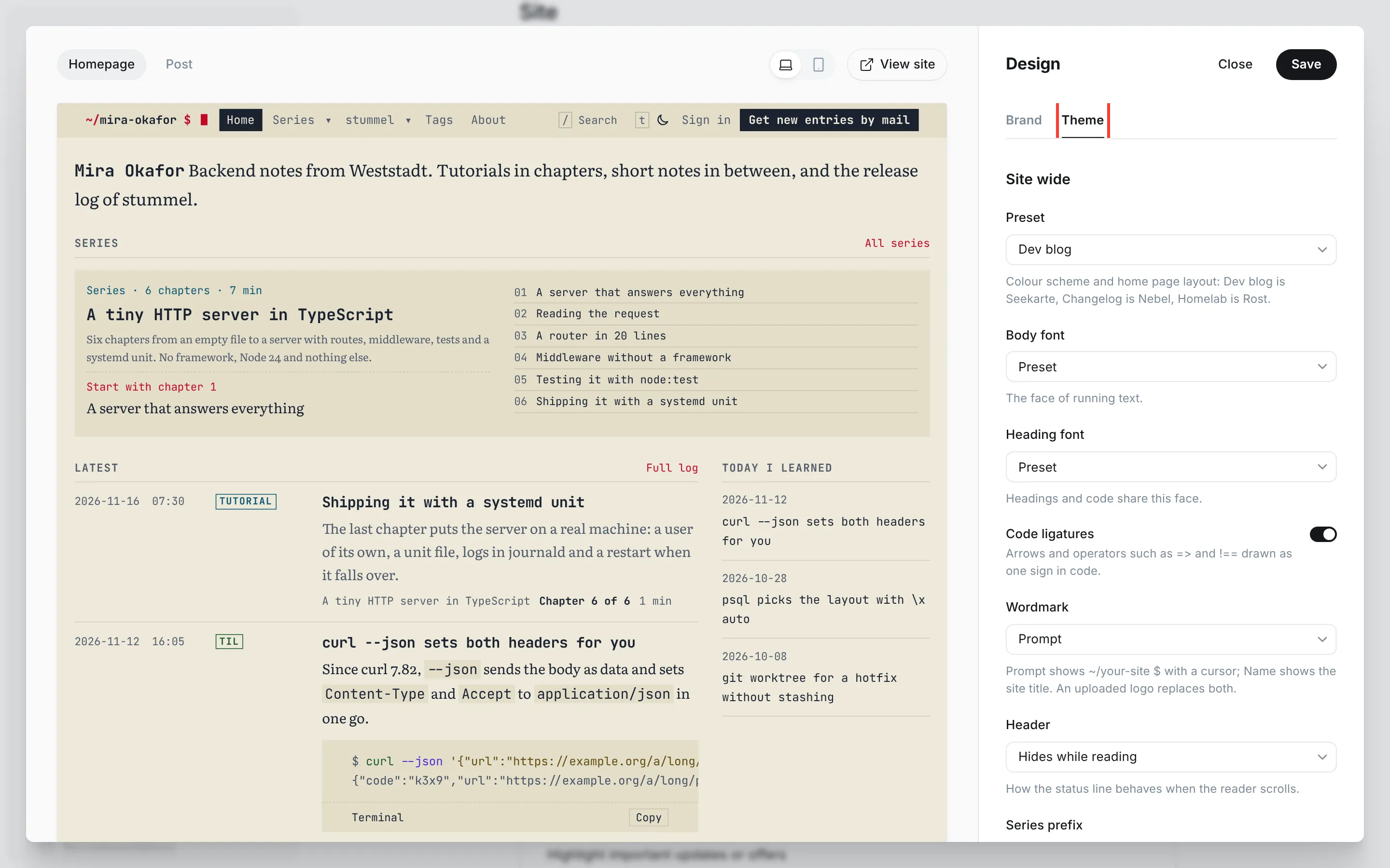
Site wide
| Setting | What it changes | Options | Default |
|---|---|---|---|
| Preset | colour scheme, home page layout and default accent colour (Presets) | Dev blog, Changelog, Homelab | Dev blog |
| Body font | font of running text (Fonts) | Preset, Fira Sans, Alegreya Sans, Petrona | Preset |
| Heading font | font of headings and code, which share one face | Preset, Fira Code, Atkinson Hyperlegible Mono, Red Hat Mono | Preset |
| Code ligatures | arrows and operators such as => and !== drawn as one sign, in code only | on, off | on |
| Wordmark | Prompt shows your site's name as ~/your-site $ with a blinking cursor, Name shows the site title as it is | Prompt, Name | Prompt |
| Header | how the header behaves when the reader scrolls (below) | Hides while reading, Stays at the top, Scrolls away | Hides while reading |
| Series prefix | tags whose slug starts with this are series | text | series- |
| Color choice | Custom adds your own colour for titles, headings and buttons (Your own colour) | Preset, Custom | Preset |
| Primary color | only shown with Color choice Custom | colour | #1B2230 |
The prompt wordmark writes the site title in lower case with hyphens for spaces: "Mira Okafor" becomes ~/mira-okafor $. A logo you upload in Ghost under Brand replaces both options.
Header decides what the bar at the top does while readers scroll. With Hides while reading it slides away as they scroll down and comes back as soon as they scroll up, so the text gets the whole screen. Stays at the top keeps it in view, and Scrolls away lets it leave with the page. Readers who asked their device for less motion see it appear and disappear without sliding. Ghost's announcement bar sits above the header and always scrolls away with the page.
Series prefix is how Logbuch spots a series: every tag whose slug starts with it gets a course page, and its posts become chapters (see Post types). Change it only if your tags already follow another pattern, such as course-, and then give every series tag a slug with the new prefix. The footer lists your series by the same prefix.
Light and dark
Readers choose this themselves, so there's no setting for it. Each page opens light or dark, following the reader's browser or phone. A button in the header switches it, showing a moon by day and a sun by night, and there's a second one at the bottom of the footer. On a computer with a keyboard, t does the same, and / opens search. The choice lasts as long as the reader keeps your site open in that tab.
Every colour scheme has a light and a dark set, and every text and code colour in them is at least 4.5:1 against its background, the contrast that the accessibility guidelines ask for.
Homepage
| Setting | What it changes | Options | Default |
|---|---|---|---|
| Homepage layout | the order of the home page | Preset, Tutorials first, Log, Changelog | Preset |
Preset uses the layout of your preset: Tutorials first for Dev blog, Changelog for Changelog, Log for Homelab.
Tutorials first opens with your series as course cards, each with its chapters, total reading time and the reader's next chapter, then the latest entries beside the newest TIL notes. It needs at least one series (see Post types). Without one, it shows the latest entries.
Log lists every entry in order with its date, time and type, shows TIL notes in full and puts filters by type at the top. The filters work on the entries of the page the reader is on.
Changelog opens with your site title as the product name, the latest version and its date, and a status line from the newest incident report. Below come the newest releases with the lines of their Added, Changed and Fixed sections, grouped under each section's name and count, and beside them the newest incidents and posts. It reads versions and status from posts with the Changelog and Incident templates (Post types).
The first page of every layout shows the site title and description. The home page lists 12 entries per page, and later pages show the entries only.
Post
These settings shape posts. Each one is a default for all of them, and an internal tag on a single post overrides it. Add the tag in the post's Tags like any other tag, with the # in front.
| Setting | What it changes | Default | On for one post | Off for one post |
|---|---|---|---|---|
| Drop cap | a large first letter over three lines, in the heading font | off | #drop-cap | #no-drop-cap |
| Lead paragraph | the first paragraph set larger | on | #lead | #no-lead |
| Small caps opening | the first line in small capitals | off | #small-caps | #no-small-caps |
| Text alignment | Justified sets the text as a block with hyphenation, Ragged leaves the right edge open | Ragged | #justified | #ragged |
| Wide text | a wider text column, 75 characters a line at most, with code, tables and cards wider still: Off, Releases and incidents (posts with the Changelog or Incident template) or Every post | Off | #wide | #narrow |
| Table of contents | a table of contents beside the text | on | #no-toc | |
| Age warning | a note on posts older than 1, 2 or 3 years, or Off | 2 years | #evergreen | |
| Feature image | where the feature image stands: Above the text, Hero with the title on the image, or Split with title and image side by side | Above the text | #hero, #split | #image-above |
| Line numbers | numbers in front of every line in code blocks | on |
The first five settings work on pages too. If a post carries both tags of a pair, the one that turns the variant off wins. On phones, justified text stays ragged, because the column is too narrow for even gaps.
Wide text suits posts with much code, many tables or cards. The text holds about 70 characters a line and rarely runs past 75, because longer lines are hard to read; Logbuch measured that for each body font, so the column is a little narrower with Petrona than with Literata. On screens narrower than about 740 px, wide text changes nothing.
With Hero, the title, excerpt and meta line sit in a box at the bottom left of the image on tablets and wider screens; on phones they follow the image, so the photo stays whole. With Split, title and image share the width half and half; on phones the image comes first. Choose photos with room at the bottom left for Hero. Pages and posts with the Changelog, Incident or TIL template show no feature image.
The table of contents is headed "On this page" and lists the post's H2 and H3 headings, with the minutes left to read below them. On wide screens it sits at the right edge and stays in view while the reader scrolls, and it shows the H3 headings of the section being read only. On narrower ones it folds above the text. A post with fewer than two headings gets none.
The age warning says "Written 3 years ago. Versions and commands may have moved on." under the date. A how-to that still works after five years can carry #evergreen. Posts, releases, incident reports and TIL notes get the note. Letters and pages don't. The age is worked out in the reader's browser, so a page that has sat in a cache for months still shows the right number of years.
Fonts
Logbuch uses two fonts and ships every choice with the theme, so no font is loaded from another server.
| Role | Preset | Choices | Where you see it |
|---|---|---|---|
| Body font | Literata | Fira Sans, Alegreya Sans, Petrona | the text of posts and pages, excerpts, the site description |
| Heading font | JetBrains Mono | Fira Code, Atkinson Hyperlegible Mono, Red Hat Mono | headings, code, titles in lists, dates, labels and the navigation |
Headings and code share one monospaced font, which is what makes a Logbuch page look like a log. Fira Sans and Alegreya Sans are sans serif, Petrona is a serif like Literata. Alegreya Sans has narrow letters, so its text column is a little narrower: a line holds about as many characters as with the other fonts. All four text fonts have small capitals and old-style figures, so the small caps opening works with each.
Ghost's own font setting
Under Brand, Ghost has a section Typography with its own Heading font and Body font. They have the same names as the theme's settings but work differently. Ghost loads the font you pick there from fonts.bunny.net, a server outside your site, and uses it in place of the theme's font. Ghost's heading font replaces the font of headings only. Code, dates, labels and the titles in lists keep the theme's monospaced font. The theme can't stop the request to Bunny Fonts once a font is picked.
Leave both on Theme default if you want your site to load nothing from other servers, and choose fonts in the Theme tab instead. If you want a font that Logbuch doesn't offer, Ghost's setting is the way to get it, as long as you accept the request to Bunny Fonts.
Your own colour
The colour schemes stay as they are: grounds, text and the six code colours come from your preset. What you can add is one colour of your own. Set Color choice to Custom, and Primary color appears. The theme uses it for the titles of posts and archive pages, the headings in posts and filled buttons such as "Get new entries by mail".
A brand colour doesn't always read well on both grounds, so the theme adjusts it where it's text. By day, a colour that's too light for titles and headings is darkened. By night, one that's too dark is lightened. Buttons keep your colour in both modes, and the theme picks light or dark letters for them, whichever Ghost finds readable on that colour.
Ghost's accent colour
The accent colour is Ghost's setting: Settings → Site → Design & branding → Customize → Brand → Accent color. Each preset has a default, and with it the theme uses the reds of its scheme as they were tuned.
Logbuch uses the accent in two ways. Marks take it as it is: the cursor of the wordmark, the progress bar of a series, the rule under the current tab or table of contents entry. Text in the accent, such as the label above a title, the ~/ and $ of the wordmark, link underlines and the drop cap, needs more contrast. When you pick an accent other than the preset's default, the theme darkens it for that text by day and lightens it by night. Measured on every background of the three schemes, the result is at least 4.63:1 by day and 5.91:1 by night. Older browsers that can't work out the adjusted colour use the scheme's own accent for text instead.
The accent is never the background of text. Buttons are filled with the text colour, or with your Primary color.